Thursday 10 December 2015

Life's a Pitch; Market Research

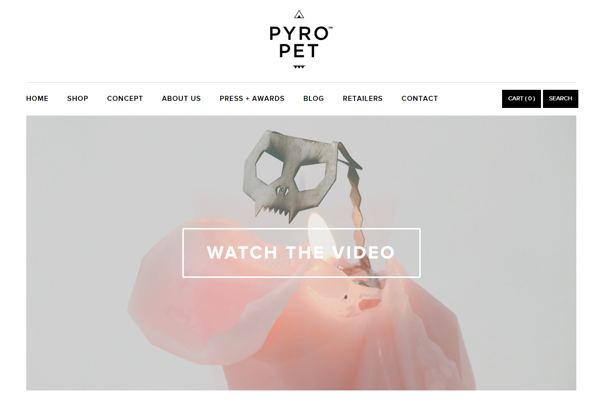
After nailing down our business manifesto, I took it upon myself to do some market research. While initially we'd identified Yankee Candles and Clintons as possible competitors, our business had evolved a lot since then. I started with two companies I already knew, the first previously mentioned Pyro Pets, and Vice and Velvet.

VICE AND VELVET


I found this company through instragram, highlighting the importance of social media // web presence. We'd always said as a company we wanted to engage with our customers and I good way of doing this would be through social medias; as well as a website // etsy it would be vital we also maintained a blog // instragram // facebook ect so customers felt they could get involved with a more personal side of the company and not just the commercial side of it. Of course overarching all of these platforms, we would have to maintain a consistent branding to ensure synergy and professionalism with our company.   

Vice and Velvet specialise in soaps "Handmade vegan soap, bath & body. Unique scent blends." While our company is based on candles rather than soaps ect I thought they were similar to our concept in their presentation, ethics and promotion // distribution. Being sustainable was something we'd always said we wanted to explore, but looking at Vice and Velvet made me think about the materials we would be using to create our candles as well as just the packaging.

Upon further research I found that most high street candles are made from paraffin wax, which is highly toxic for the environment, whereas alternatives from beeswax and soy are considerably better! This was double great news as we already had a beeswax range in place, but the notion that our basics and black magic range could be made of soy, so not only would they be more eco friendly, but we could target the ever growning veggie // vegan market for our candles! Soy can also be coloured and scented so it wouldn't provide a practical problem in terms of manufacturing what we wanted.

Vice and Velvet also made me think about our online presence in a website VS etsy way, if our company was based purely on etsy there is a worry of our company being lost among the thousands of others on that site, our own website would help combat that.

VIOLET & LARK


Once I'd read about soy candles I decided to look and see if there were any companies that specialised solely on producing them, I found Violet & Lark which not only provided soy candles, but beeswax candles too. There seemed to be a market then for luxury candles with an environmental conscience online. Like the previous two companies their website was simple and easy to navigate, this would be useful if targeting a larger spectrum of possible clients; something easy to use for older people, while still maintaining a professional and contemporary outlook to appeal to younger audiences.

P.F. CANDLE CO.


P.F. Candle Co. was another company specialising in soy candles, it was also around this point I found out that soy not only releases considerably less toxic fumes into the environment, but also burns at a lower temperature, meaning the candle burns for longer; another great reason to use them in our business! Both Violet & Lark and P.F. Candle Co. sold candles made of materials that we would be interested in using within our business, however with the handmade and human quality of Vice and Velvet soaps, and Pyro Pets 3D illustrative and treasureabilty. 

Monday 30 November 2015

Life's a Pitch; Business Concept and Manifesto

I think this session was very helpful in locking down what our company was really about. At the core of all of our ideas up to date was the notion of high quality illustrated candles, with this in mind we worked though the business concept sheet and I felt as though we were getting a much stronger idea of the real values of our business. 

BUSINESS CONCEPT

Having a positive impact was something we all felt very strongly about, and having good communication and valuing the costumer service we provided was important to us, building on from this we started thinking about how one of our ranges could work with charities, and we came up with the 'bee' range of candles. Given the dwindling number of UK bees, making candles from beeswax in a sustainable way that could help the growth of the population was something that strung a cord with us. The candles could be in various shapes such as beehives, honey combs, bees themselves, to make them more desirable and appealing to audiences. 

From this we started thinking of other possible ranges we could have; starting the business with a few solid ranges that could then filter into more in the future felt like a good place to start. We tried thinking of stereotypes who use candles, we came up with the idea of a 'black magic' range as another idea; targeting those who are into something a bit more niche and out-there. We considered current retailers who specalised in crystals, Gothic aesthetic and memorabilia as competitors for this range. In regards to distribution however, we could work with these independent outlets to get some of our candles on the high street; towns such as Whitby would be a perfect place to push this range. Thinking about the 'look' of this range we thought about all the candles being made of black wax, as not many candles are available in this colour, and making them in a range of shapes to fight competitors eg skulls, bats ect. It was also suggested at this point we could include more novelty things in this range such as glitter or hidden objects in the center of candles once they burn away, to make them even more desirable. 

With these two ranges in place we thought it made sense to include a 'basics' range. These candles would all be sustainable, and would be centered more around variations in colour and scent when compared with the other two ranges. It was hoped this range would be accessible to all kinds of people, students especially, who make up a large percentage of candle consumers.  

With all this in place we also finally came up with a name! Matchboxx was something that felt simple and accessible while still relating to our products. Originally we played around with the idea of including small promo matchboxes as a type of promotion or to send with our candles containing safety information. Though we'd decided to step away from the fire safety element as such the word 'matchbox' still felt very applicable. After a quick google search we found the name 'matchbox' already belonged to a toy making company, so we changed our name with the additional x, I feel this also makes the company sound like more of a brand rather than just an object.

BUSINESS MANIFESTO

Once our concept was more concrete, I felt a lot more confident producing a manifesto. Our values were those of creating a positive impact while providing high craft and quality 3D illustrated candles. The term 'meet your maker' was coined as we were discussing our roles as designers for the business, this helps make our business feel more accessible and ultimately HUMAN. Being a business of PEOPLE rather than a corporation was very important for us to communicate. 


FINAL MANIFESTO


'Matchboxx' is a company of creatives based in Leeds, dedicated to making high quality candles with a sustainable positive impact whilst inspiring individuals to think outside the (match) box. We believe that knowing you is essential to that process, customising our products to meet your personals wants/needs and making you feel part of the Matchbox family.

Wednesday 25 November 2015

Life's a Pitch; Haiku's and Development

Today's haiku task was very difficult but helpful in highlighting weaknesses in our businesses proposals so far. I feel due to the broadness of our company at the minute, it was hard to pin down our core values // aims. I also feel our tone of voice was slightly off; this was also probably due to our lack of focus within the company.


Our final haiku "The candles that wow, Handmade for all occasions, For your creative self" felt to me very vague and a little passive. The overall feedback was a little mixed as well and I feel people were unsure as to whether we were designing the candles ourselves or designing custom candles that other people wanted us to make. At the moment our idea is that we would design illustrated candles and sell those, with the customization coming through via colours // scents ect. We were also thinking about maybe involving other illustrators to design for us once the business had grown.

Personally I feel the range our business currently offers needs to be reduced. The fire safety element of it feels a bit of a stretch and over-complicating, as well as maybe the gift sets // additional cards and packaging at this point. It would perhaps be a stronger business if we were just to focus on one thing, high craft candles, then try and juggle all these various things.

PYRO PETS

One company I've looked at in regards to market research is Pyro Pets, they've set up a business that was originally started by just one art student, that focuses solely on high quality and crafted candles that people want to cherish and have a sense of personality and individuality about them. I feel rather than try doing all the things we're trying to do now, cutting it down to a stronger concrete idea would be beneficial to our businesses development. 

Friday 20 November 2015

Life's a Pitch; Initial Concept


When coming up with our initial business proposal, we wanted something we felt we could all contribute to and excited us. As we were going through various ideas we came across the idea of illustrated candles, bringing together illustration and product! It was also something we felt we could capitalise on as most 'arty' type people also had candles, as well as students as a whole. This business would be a way of bringing contemporary illustration a little bit more into the mainstream.

We've started with a broad range of ideas of what the business could be // how it could expand further. We could either use 3D illustration to make the candles different shapes, or simply illustrate around them? Gift sets, custom candles, various smells as an option?

We also mentioned the idea of the company branching out into something eductional in terms of fire saftey in which we'd go to schools doing talks and running a 'make your own candle' kind of workshop. Of course there would probably be insurances ect to consider if working with children.

Being sustainable is also something we are all interested in and want the business to incorporate. We could work with charities // make sure all our products are eco friendly? 

At this point our target audience is rather broad, in terms of promotion and distribution at the minute it feels very much web based with maybe a vehicle to help us tour around schools. We've also thought about taking our business to fairs that cater for our differing audiences, eg wedding fairs for bigger expensive candles but maybe craft fairs for the smaller ones? Lots of options and things to consider at this point.

Monday 16 November 2015

Study Task 3 - Creative Industries - Sectors and Services

The Dark; Children's Book by Jon Klassen

SECTOR: Tertiary Sector // Private Sector 
RELATED SERVICES: Creative industries; Publishing // Wholesale and retail trade // Education
SUCCESS OF THE WORK: Illustrated by Jon Klassen and written by Lemony Snicket, The Dark could be considered to be a success in most of its sectors and services. In regards to retail and private sector, the book has been a success; it made the Greenaway Medal shortlist of eight books, receiving many stand out reviews and commercial gain. Not only did the reviews aid in the retail aspect of this book, but they also showcased the high regard this book was shown in for its artistic and illustrative qualities; big thumbs up all around!

IKEA 'Tree Bark' Noteblock

SECTOR: Tertiary Sector // Private Sector 
RELATED SERVICES: Wholesale and retail trade // Creative industries; Crafts 
SUCCESS OF THE WORK: As this product is been sold by the major retailer IKEA, it would suggest this product is highly profitable (has been in stock in IKEA for over a year now), thus implying the private sector company is doing well from it. This could, in part, but due to its innovative idea (a notepad made from recycled paper with a little story at the front, made to look like the bark of a tree). The commercial success of this product, could however, therefore make it seem less authentic and hand crafted (just another product on the line) and take away from its props to the artistic community; this could be argued either way though. Just because a piece is commercially successful//successful in the retail world does that make it less valuable in terms of its creative industries attributions? 

Oh Comely

SECTOR: Tertiary Sector // Private Sector 
RELATED SERVICES: Creative industries; Publishing // Wholesale and retail trade
SUCCESS OF THE WORK: Started a mere few years ago, Oh Comely has become a name often uttered in most independent//art specialist magazine stockists (Colours May Vary, MAGMA ect) but the magazine has even taken a step into the big commercial world with stockist such as WHSmith. This journey from small art driven shops to bigger retailers would suggest it has made a lot of progress in terms of wholesale and retail. The Magazine also, I feel, manages to very strongly retain its artistic values and modest art driven status, proving to be a shining example of showcasing contempary illustration with commercial success.

Scottish Shortbread tin from M&S 2013

SECTOR: Tertiary Sector // Private Sector 
RELATED SERVICES: Wholesale and retail trade // Creative industries; Advertising
SUCCESS OF THE WORK: Stocked in M&S this piece, especially during its run around Christmas time, proved to be a big retail success selling thousands of tins. I would put this down to a pairing of artistic//illustration skill with the retail private sector power of M&S. Not only is this tin aesthetically pleasing and well designed in terms of illustration, but because of the money M&S have as a private company, the final product has a high level of finish to it and will have been shipped out to hundreds of shops nationwide, providing a wider scope for sales, and therefore success!

Face Sculpts for Laika's Paranorman

SECTOR: Tertiary Sector // Private Sector 
RELATED SERVICES: Creative industries; Film industry//Animation industry//Post-production 
SUCCESS OF THE WORK: Given that these pieces were made in preparation for a larger piece (the stop motion film Paranorman) its hard to measure their success without measuring the success of the film too. These pieces obviously worked well enough to be used in the final film, and while they will have cost money to make without producing any money themselves, they played a part in a feature length film which in turn made a huge profit. The success of the film is a reflect of the successes of each small artistic aspect of the film such as these face sculpts.

Friday 13 November 2015

Visiting Speaker; Victo Ngai


Attended Rhode Island School of Design
"Fine artists like to make problems for themselves while illustrators like to solve problems given to them"
"Possibilites within limitations" (scale, colour ect - brief driven)
"Communication - create visual solutions to bridge between clients and audiences"
"Ideas first" - keeps work fresh and exciting
Uses pen and ink (dip pen) for work

EDITORIAL

Be sensitive towards briefs, make things deal-able and overcome-able
Reverse engineer; what do you want to draw first, make it fit to brief
Make use of cropping "possibilities within limitation" 

STORY AND BOOKS

Given concept and characters
Pick right moment to illustrate story
GOOD COMPOSITION is very useful
Capture that one moment in an image
Bring own interests into commission work
Vertical perceptive, further away things are more on top of image they are

POSTERS

Your interpretation of movie, be more free with collectors editions of posters 

ADVERTISEMENT

Make lots of tweaks
Hit and miss about how fun it is
"More money, less freedom" (very long brief e.g. McDonalds brief 20 pages of detail)
Try to put yourself into it but feels less fulfilling
When working on something big and corporate good to have something smaller and more personal on the side to feel fulfilled 
Can get very anal about products and how depicted 
Web work is usually a lot cheaper than big corporate briefs, less preproduction, more freedom with web pieces
Small details make projects more personal

MAKING CLIENT WORK PERSONAL

Important to make work personal
Personal work can lead to commissioned work
Boil brief down to the essence 
Image paired with article then puts it into context but can work as a lone image "want someone to hand it on their wall"
"Style is overrated - it's merely a habit of drawing"

PRACTICAL

Hybrid of traditional and digital medias (pen and ink plus photoshop)
Use of lightbox to build up textures
Digital allows for changes in colour before committing to final image
If you create a world as long as the vocabulary is the same it will work - What are your boundaries? Don't just want to capture life like realities; don't just want photos, make something photos can't make
Values are very important in a piece (black and white) - consider contrast and density (noise within piece)

EVOLUTION

Good to have far sided goal but also good to step back from that and concentrate on 'now' and close goals
"Step by step"
"It's not how good you are it's how good you want to be" - Paul Arden
Have big ambition!
Believe in the work you are sending off even if they're just scamps!
"Obstacles are for eliminating the ones who do not want it enough"
"If you cannot be wise, pretend to be someone who is wise, and then just behave like they would"
"Good artists borrow, great artists steal"
"Sleep when you can!!!" - Victo Ngai

Q&A

Be as structured as possible, timetables and plans, emails done at the start of the day; answer important ones straight away, don't let them pile up
Realise that you can be motivated, push yourself, use your self doubt to push you further. It's okay to take yourself out of the work sometimes; refresh
Lines and colour become more integrated; like a painting
First few years need a part time job, get something that doesn't drain your creativity, keep pushing
Looking at colour palettes from other pieces lead to better personal understanding of colour and how it works, can now draw on self more than others now
Editorial dictates layour template for pieces
Be thick skinned, do a lot of footwork, portfolio reviews very useful; face to face, still send off promo packs but human networking helps a lot
Got an agent within year of finishing studies for VISA, but best to wait a little longer to give you more bargaining power. Need trust with agency. Do a lot of promo work for yourself
Don't miss deadlines, want good reputation 


Saturday 31 October 2015

Study Task 2; Reflective Practice & Professional Contexts

Products// Contexts// Functions of Illustration

NOTES

- Physical and conceptual contexts can be attributed to illustration
- Can anything be illustration? // What can illustration be?

Drawing - Image making - Illustration

DRAWING; process, research, exploration
IMAGE MAKING; shape, composition, colour, visual language, consideration
ILLUSTRATION; context, communication, solving problems, function

-Illustration is a broad term, can mean a lot of different things
-What is illustration to me? // What do I want it to be?

SIX STARTING POINTS FOR THE CONTEXT OF ILLUSTRATION IN THE CREATIVE INDUSTIES

- Publishing and book design
- Editorial and Reportage
- Character and Narrative
-Product and Packaging
- Retail and Merchandise
- Object and Environment

Three examples of contexts of illustration within the creative industries and possible products, contexts and functions

TASK

PUBLISHING AND BOOK DESIGN

The Dark; Children's Book by Jon Klassen

Monologues for the coming Plague; Graphic Novel by Anders Nilsen

Nobrow 9 'Quiet'; Collection ft Various Artists//Illustrators

Dear Self; Own Zine to be sold at Thought Bubble

Oh Comely; Interview with Illustrator Kaye Blegvad

PRODUCT AND PACKAGING 

IKEA 'Tree Bark' Noteblock

Charlotte Mei 'BRB' cap

Lize Medding wooden pin bought at Thought Bubble 2014

Scottish Shortbread tin from M&S 2013

Mibo 2015 calendar 

CHARACTER AND NARRATIVE

Mingjue Helen Chen's Monkey King as featured in the book LOVELY; Ladies of Animation

David Colman character sketches for his Character Design book 'Bears

Concept art for Disney's Rapunzel by Glen Keane

Face Sculpts for Laika's Paranorman

Amelie Flechais' book Le Petit Loup Rouge

EDITORIAL AND REPORTAGE 

Sam Taylor for NME Magazine

Laura Carlin for 'Inside a Rape Trial' by Barbara Toner

Anna Kövecses for Diagnosis, The New York Times Magazine

Louise Rosenkrands: Choice of Education

Wednesday 21 October 2015

Big Heads; Kyle Webster

Big Heads; Kyle Webster

NOTES

Based in North Carolina between the mountains and beach
Traveled a lot as a child
Illustrated annuals opened his eyes to what an illustrator was
Society of Illustrators; got him work in 2003
Realization he could create work then find a market for it// didn't have to wait for brief's to come in
Figure drawing//life drawing was very important to him; a lot of time spent on it
Adaptable and diverse; confidence in drawing important
Considers himself "a working man's illustrator"
Being open minded can make for a longer career
Brushes used by over 100,000 people
Success of brushes largely because it was what artists wanted; something more analog 
"You have to be able to draw properly to utalise your tools"

WHAT MAKES GREAT ILLUSTRATION

"If it goes beyond simply decorating a page"

ADVISE

"Pay more attention to colour theory"
"Stay late to be better at drawing!
"Learn more about contracts, rights, fair fees ect"


Thursday 15 October 2015

Sarah McNeil

Peach Spell Zine

SARAH MCNEIL

- Lovely use of print for both limited edition run of risograph prints and zines
- Strong use of colour
-The juxtaposition of text and image works very emotively, something I want to try to do more of in my own work
- Feels very personal and hand crafted
- Self initiated work sold on Etsy; making personal things assessable and relatable
- Abstract story telling
- Nostalgic 


Sleep Zine

PUPS Zine


Wednesday 7 October 2015

Made You Look

Made You Look from Look and Yes on Vimeo.

Recently myself and a few of my peers went to Hyde Park Picturehouse to see Made You Look. The viewing also contained an post screening Q&A discussion with current practitioners, Leeds based Colours May Vary owners and a co-producer of the film.

I absolutely loved this film, the discussion between digital and analog and the dependency of one on another was a debate I was very interested in hearing about; the renascence of analog illustration in the current industry was also comforting to hear.

What really struck me about this film however was that illustration can be MEANINGFUL! Although there is a very strong sense that illustration is highly commercial, what I liked about this film was that illustrators were being commercial successful whilst SAYING SOMETHING with their art. A lot of the practitioners talked about the importance of the real world and doing things on their own. It really got me thinking about my own practice and what I want it to be. I want to feel as though my illustrations have a sense of real world authentisitcy about them rather than just being a replica of the 'in' style of illustration. 


Study Task 1 - Who am I? Why am I here?

STUDY TASK 1


IDENTIFY 5 THINGS YOU HAVE LEARNED SO FAR ON THIS PROGRAMME 

- Bad drawings are useful drawings
- It's okay to struggle
- Things are easier if you're enjoying it (don't force things//do things last minute)
- Blogging through problems can be extremely useful
- Illustration isn't just 'pretty pictures'

IDENTIFY 5 THINGS YOU WANT TO KNOW MORE ABOUT

- Ceramics (process and production)
- Illustrators as 'graphic artists' 
- Self publishing and branding (own zines//merch ect)
- Working as an illustrator (pay//taxes//business ext) 
- Developing my tone of voice

IDENTIFY 5 SKILLS YOU THINK ARE YOUR STRENGTHS

- Being passionate
- Self discipline
- An eagerness to get better//push myself
- Be honest with myself about my work (ciritical)
- Craft

IDENTIFY 5 THINGS YOU WANT TO IMPROVE

- To push my skills in craft to a more proffessional finish
- Make sure I stay on top of blogging and manage time well
- Being more exhaustive in research and scamping//sketch booking
- Translating more imidiate and expressive mark making that comes across in sketchbook play into final work 
- Putting my illustration into new contexts and products

IDENTIFY 5 PRACTITIONERS THAT DEMONSTRATE YOUR INTEREST IN ILLUSTRATION

- Charlotte Mei
- Babs Tarr
- Sarah McNeil
- Lizzy Stewart 
- Hellen Jo

IDENTIFY 5 WEBSITES//ONLINE RESOURCES THAT DEMONSTRATE YOUR AREAS OF INTEREST WITHIN THE CREATIVE INDUSTRIES

- ItsNiceThat
- Instagram
-Varoom-mag
- Oh Comely
- Etsy

Monday 18 May 2015

End of Module Evaluation


1. What learning have you inherited through this module and how has it impacted on your own understanding of professional practice? Consider yourself as a student at University as much as an illustrator

I think towards the end of this module I have really learnt the value of honest and true self-reflection. At the beginning of the year I think I felt a bit lost in terms of PPP and what it meant, and I think that was largely in part to me not reflecting on myself and my practice deep enough or with enough context. With the last two briefs however (SB2 & SB3) I’ve found that a lot of what I’ve learnt through PPP has all come together. I’m starting to really understand why I like the work that I like and how that affects me as a practitioner. I’m also finally starting to really think about where my own work fits within this huge ‘illustrationsphere’ and it feels good to start figuring that out.


2. What approaches/ types of research have you found most valuable over this module? Why did they have such an impact?


I’ve really found looking at other artists and illustrators to be valuable this year, not only in PPP but in other modules as well. By looking at existing practitioners work and understanding why it is successful in both a professional sense and a personal sense, I’ve found my own work develops and grows more. Through better understanding the professional illustrating world I can better understand my place in it and where to push my work next.

As previously mentioned self reflecting and blogging through issues and concerns in my illustration has also proved extremely helpful recently and it something I want to take with me and continue into next year. 


3. In what way has PPP informed the way your work in other modules and your illustration practice as a whole?
PPP has recently become very useful to me, I feel that I started the year with good intentions and regular blogging, however this waned when SP and COP really kicked into swing. This is a shame as recently PPP has been hugely useful in understanding my own practice and my struggles within it. Next year I wish to consistently blog PPP, as it’s useful for not only the aforementioned reasons but also because I think it’s good to look at artists, illustrators, events happens ect outside of SP briefs and modules. I would also like to get into the habit of blogging regularly about non-illustration related things that impact me as I feel they too have a role to play in how I’ve developed and grown this year overall.


4. What weaknesses can you identify in your PPP submission and how will you address this in the future?

As mentioned before, during the beginning of the second term my PPP blogging did suffer; it was something I put off as I thought the more immediate deadlines needed more attention than PPP, however if I had blogged and reflected as regular on PPP as I have recently maybe I wouldn’t have had the struggles I had later on in other briefs, or would have come to conclusions quicker.

In this same vain I also didn’t blog things like exhibitions I went to, films I watched or non-illustration related things, which would have been extremely helpful. I feel as though they did shape a lot in the way I’ve worked or things I’ve thought about or considered and not taking the time to truly reflect on this may have lead to me not learning as much//taking as much from experiences or influences.


5. What communities of practice and professional contexts do you intend to investigate further as you approach level 5? Why do they appeal to you?

I really want to look at more lo-fi and loose illustration within the future. I feel like one of the things I’m really interested in is recording authentic feelings, experiences, emotions ect and I feel I do this best when things are stripped back a little bit, and a little looser too. I want to look into ceramic illustrators like Laura Bird, Jen Collins, Eleonor Bostrom, Charlotte Mei and Leah Reena. I’ve found a few other illustrators such as Joohee Yoon who work quite texturally with shape and the landscapes of Marcus Oakley have also currently caught my eye. I’d like to look more into reportage illustration as well as zines, as they’re something I’d like to try more of but haven’t really experimented with this year.

I’m still a little unsure of how my work will develop or where it will sit exactly by the time I’m finished at LCA, but for the first time I feel quite comfortable in what I want to explore, what I want to push and what I want my illustration to express, and that is primarily in part to PPP.


Final Images


Final photos

Poster

EVALUATION OF FINAL PIECES

I feel that through this final project, although short, I've learnt a lot. The process of transferring my 2D illustrations into a 3D setting has been something that I've really enjoyed and I feel has pushed me to think about my illustrations in a new way. I also feel as though stylistically my work has started to take shape, though this is something I'm really hoping to practice and expand upon even further through the next few months and even years ahead.

I'm also quite proud of the way the end poster has come together and would like to get it printed professionally at the print dungeon ready for the final year show. The photo's themselves act as a sort of summary of my year as a whole and I think overall they show a lot about how my work has developed and what I've learnt. I also think in a practical sense, that keeping the photographs to a similar brown//grey//cream colour palette they work well together as a set; though I feel if I were to do this again I would retake the vector photograph so it fit in better with the hue of the other photos, and while the digital glare does at a sense of tension to the piece I feel this is a little off putting and perhaps the photo would have worked better if I had placed my cut out over a print of my vector or had scanned in my cut out and placed it on the vector digitally instead.

The self reflections I've undertaken in this brief have also helped me to grow in confidence and awareness of my own practice. I finally have an idea of what I want from my work and what to push further. I'm very much excited for the next few months and what it holds ahead.